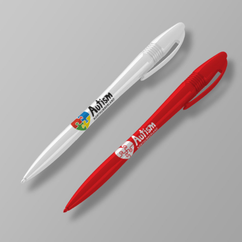
Autism Northumberland
The challenge
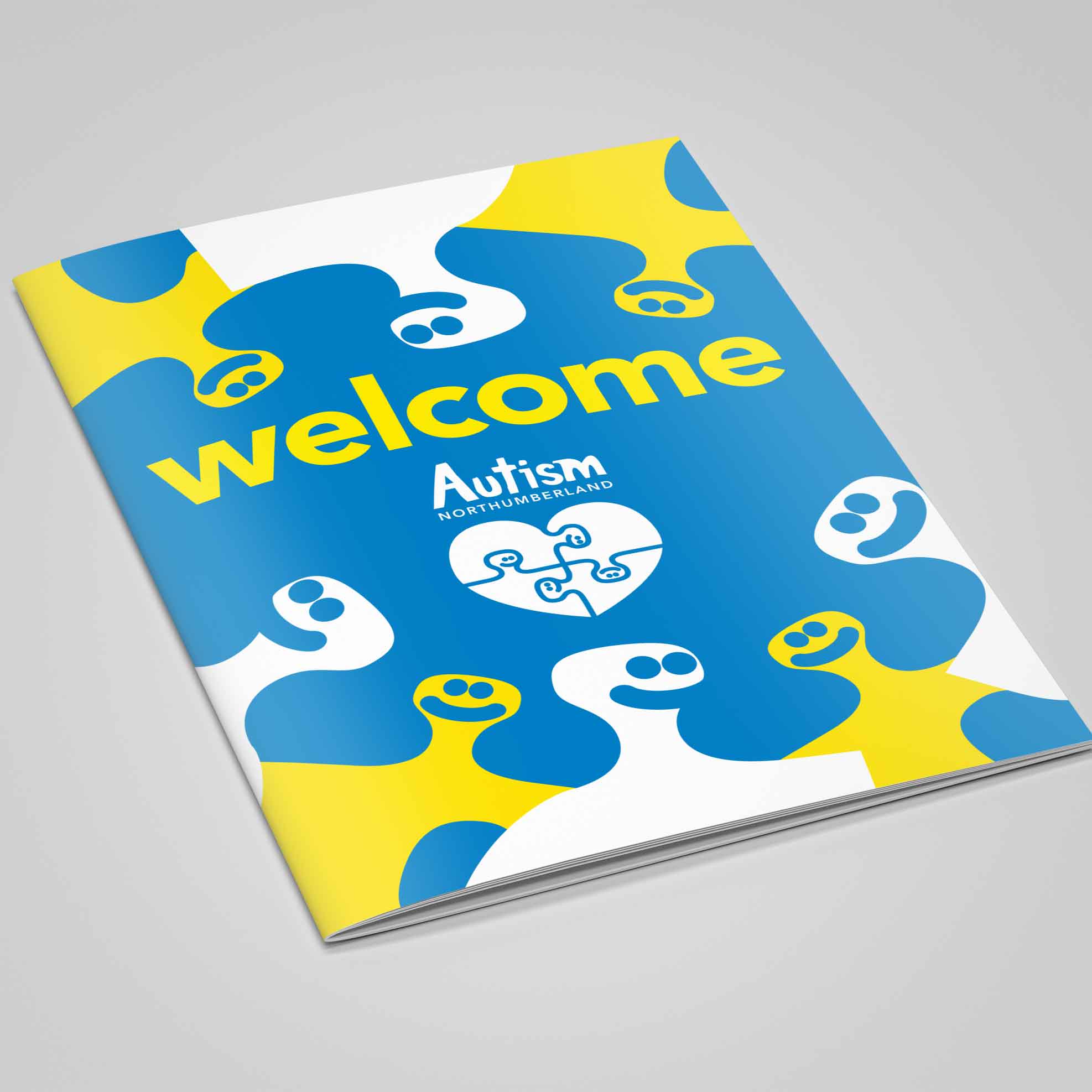
A newly formed local charity helping families struggling with local authority provision for autism support, Autism Northumberland approached us to professionalise their identity and promotional materials.
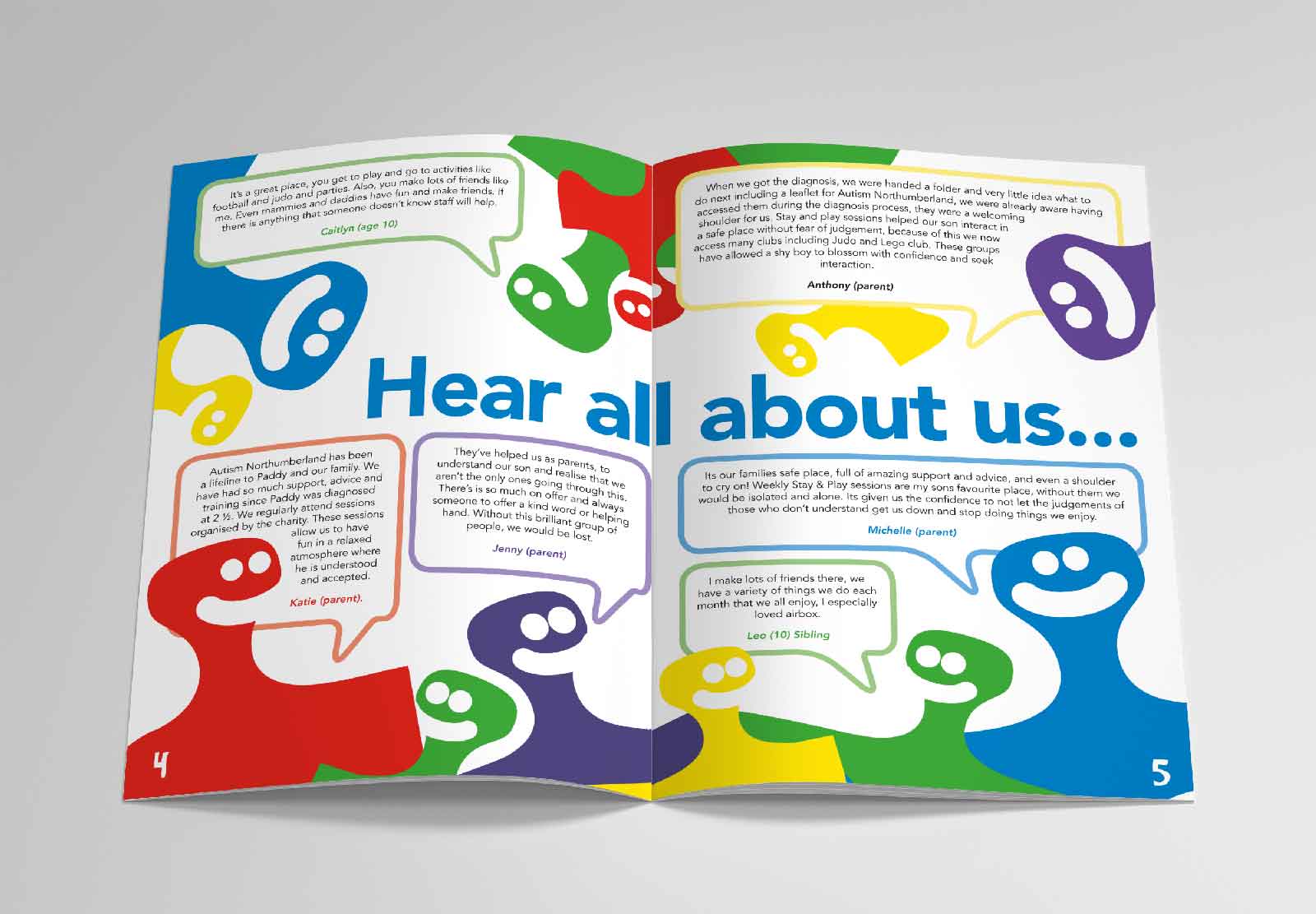
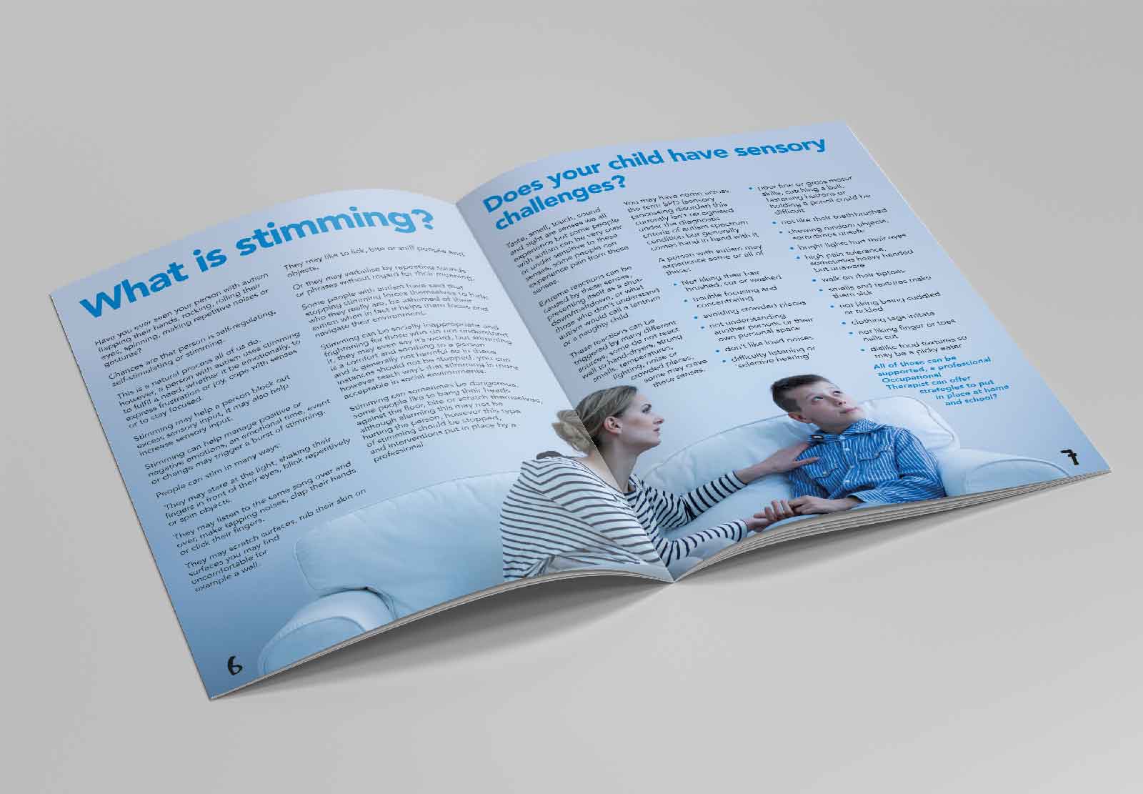
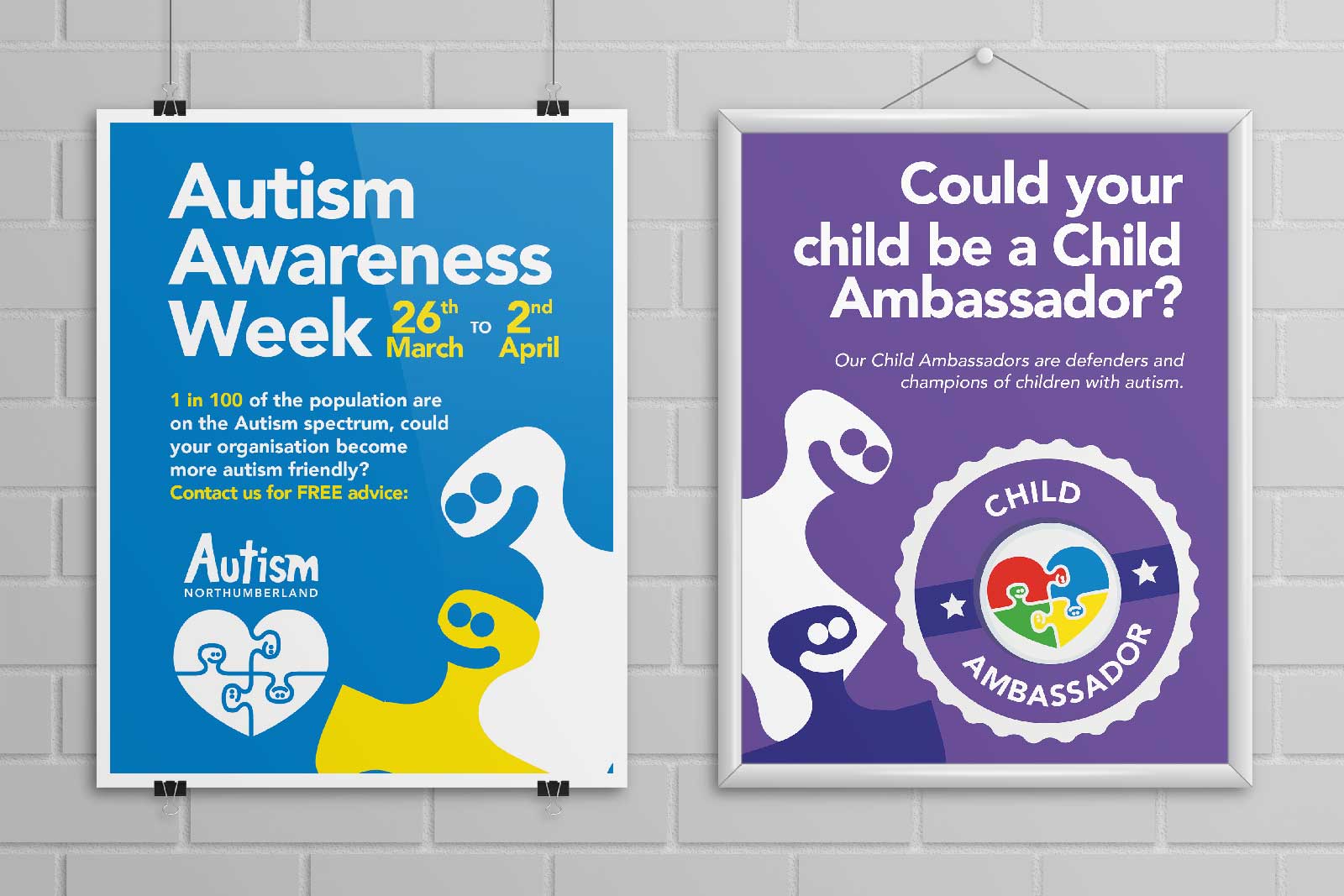
The solution
Already using a heart shaped primary colour jigsaw, we sought to tighten and focus the brand by adding the human element. By giving each piece of the puzzle a face we looked to highlight the tight knit collective of both the autistic children and the families all working together. Fun sketchy typography combined with the new icon provided the confident and outward look the client was hoping for. The ‘pieces’ of the icon were then used as branding elements throughout their wide range of promotional materials.
