For those of a nervous disposition, look away now…
Published July 27, 2024
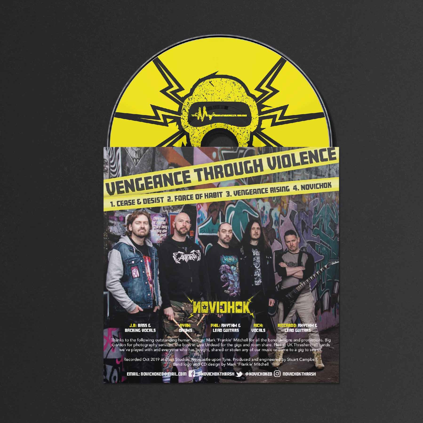
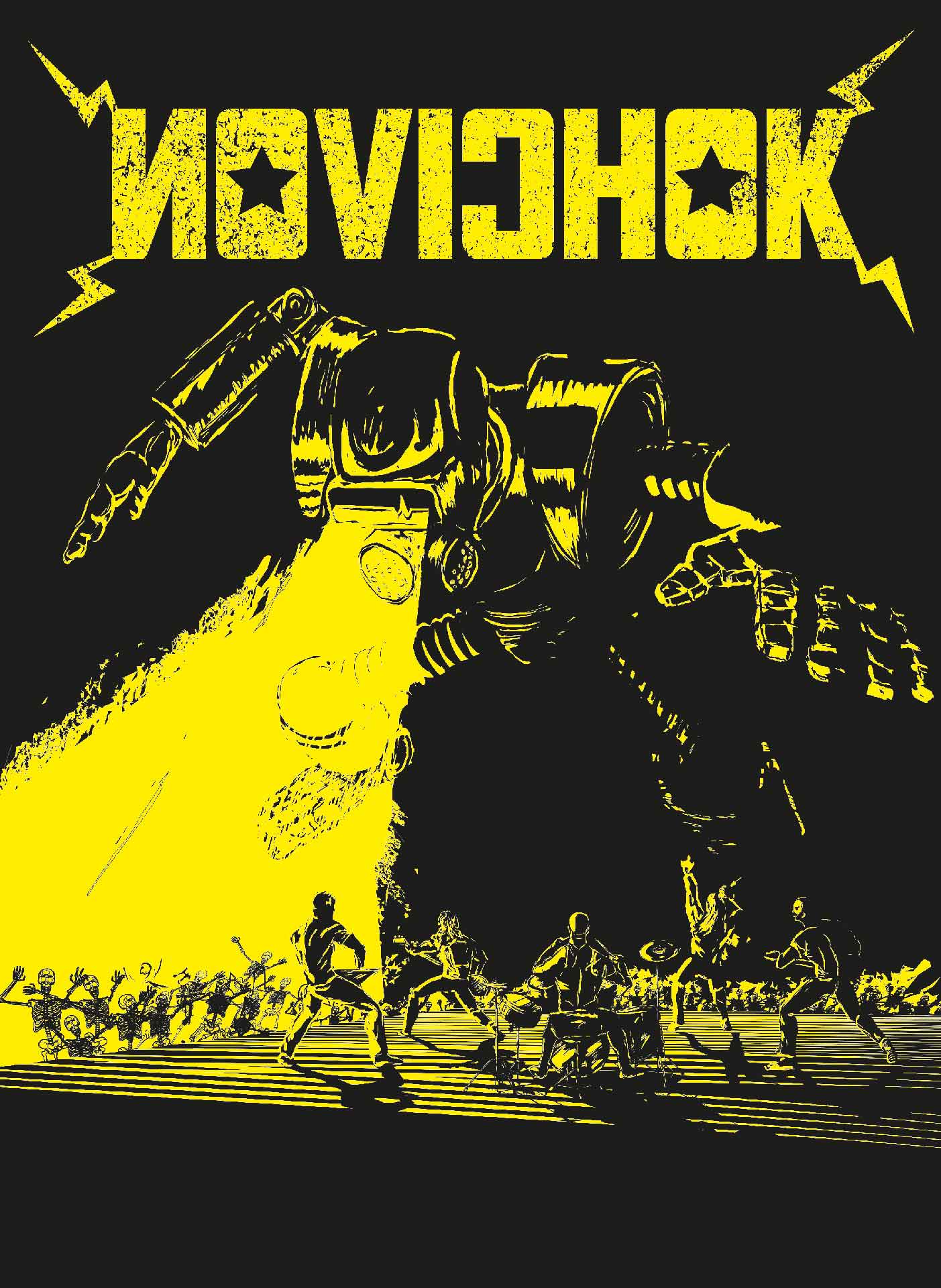
Those that know me personally will probably be aware that I’m a metal fan, so when some good friends of mine formed a thrash metal band a few years ago I jumped at the chance to dig into the 80’s Bay Area aesthetic of (slightly before, honest) my youth to come up with a logo and design for their first EP.
Both with the band’s name and the design aesthetic, the aim was to invoke the 80’s Reagan era Soviet paranoia, bands like Anthrax, Sacred Reich, Nuclear Assault and Exodus. So Russian looking spiky and threatening. Check.
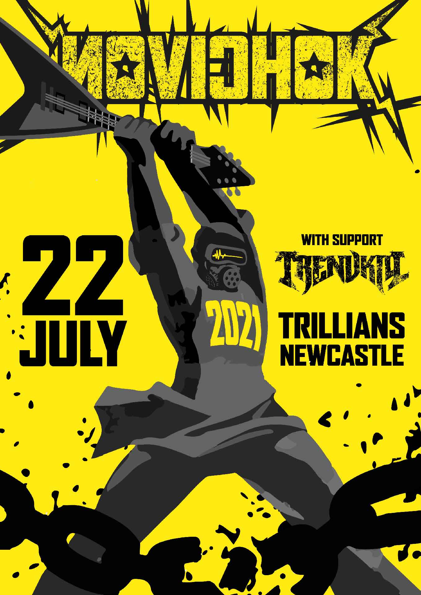
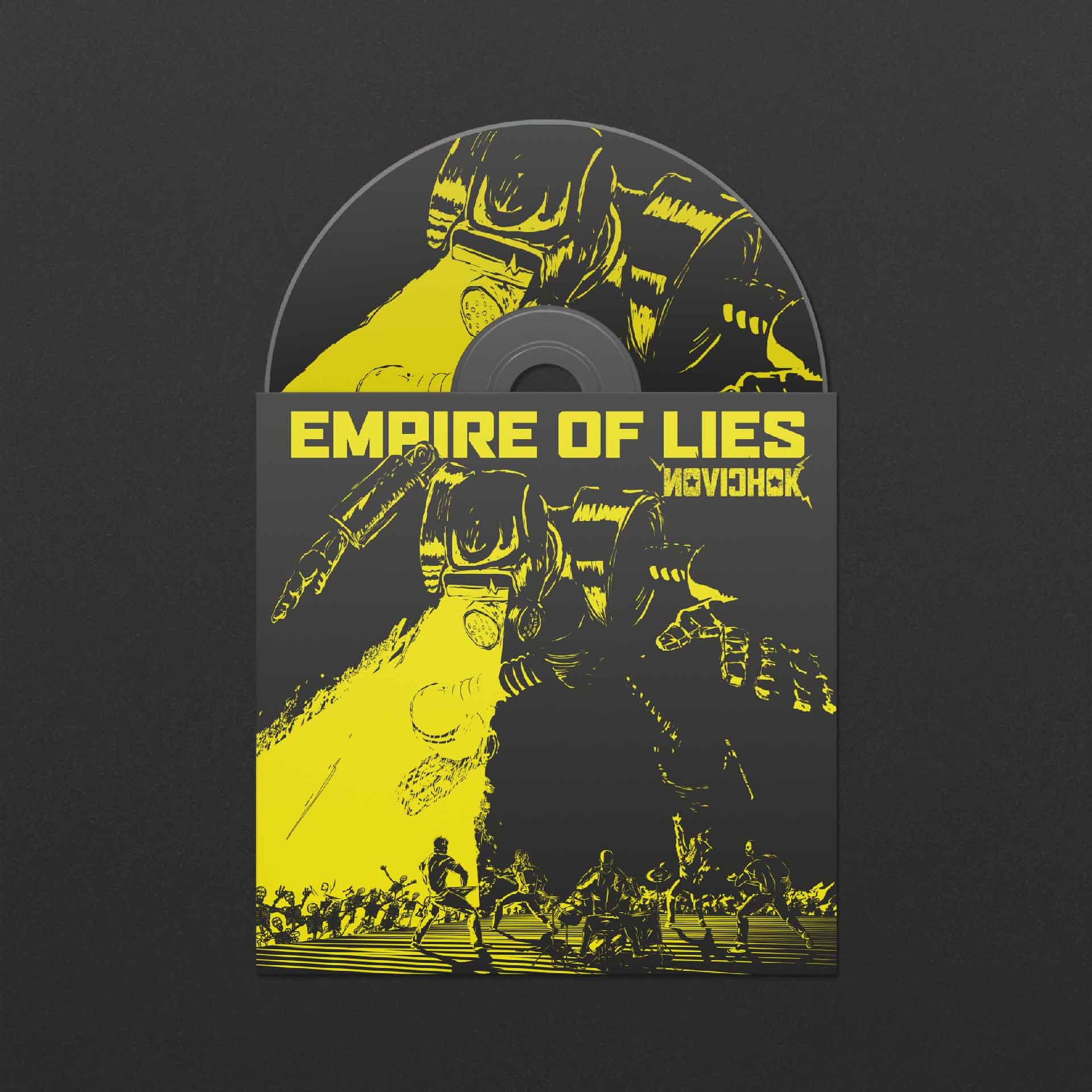
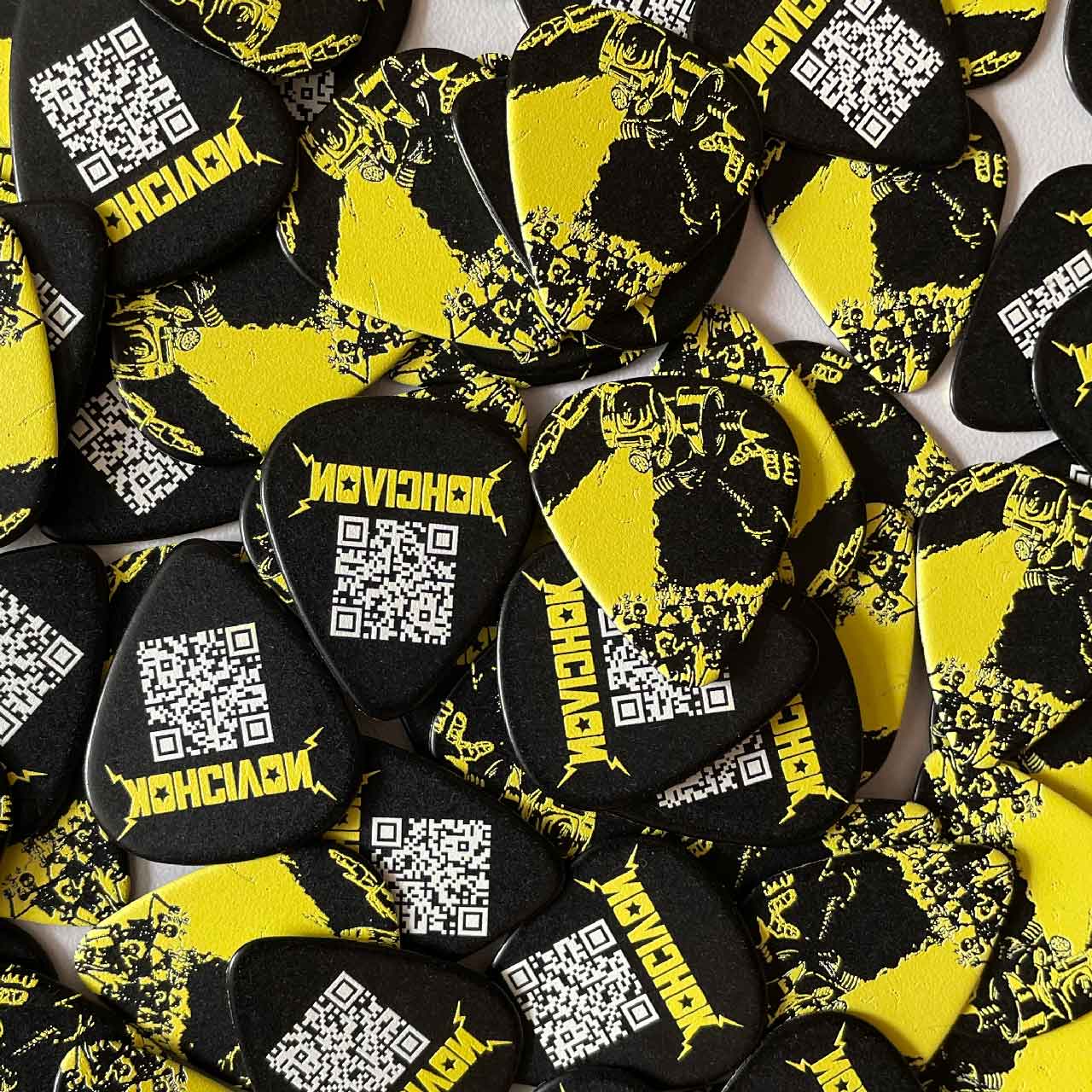
The concept of the gas mask icon is simple – Novichok being a nerve agent, the traditional military PPE won’t protect you – hence the flatline of the ECG in the visor. The yellow and black high contrast colours also invoke lo-fi gig posters of the 80’s, which I extended to the treatment of video in the couple of gig promo clips I put together.
We went further down the the road of Soviet propaganda – referencing a famous poster for the first post-covid gig. And our gas mask icon developed into more of a character – Boris, another staple of 80’s metal, see Megadeth’s Vic Rattlehead or Iron Maiden’s Eddie.
A lot of fun to work on and great guys to work with, there’ll be more in the future, but if you like your metal old skool and your world view is apocalyptic, check Novichok out at the link below:
